Client
Take The Cake
My Role
Case Study, UI/UX Design, Wireframing
A baking blog redesigned.
Problem Overview
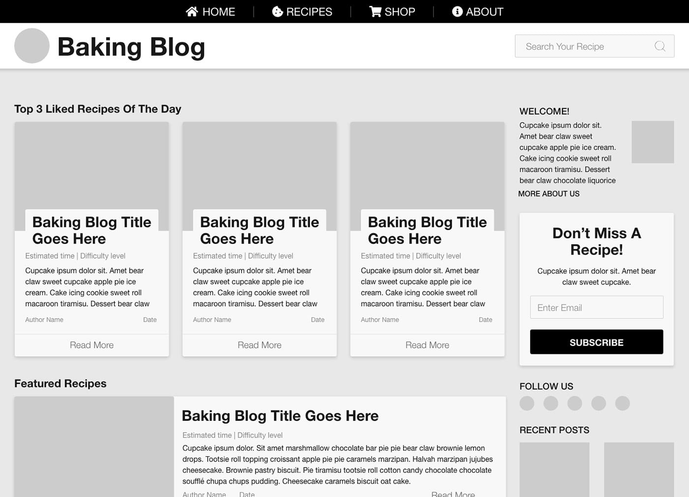
This client had begun re-evaluating their blog and felt that it fell short of meeting their business goals. They were in search of something that was ‘logical’, easy to understand and had content that helped recommend recipes to users. The first phase would be to create a wireframe that met their needs of enhancing a user’s experience when navigating and using their site and the last phase would expand on the wireframe and developing two additional iterations that put the focus on the blog’s baking products and target users.
Target Users
One of their business goals was to increase their focus on their core customers: tech-savvy elderly women and baking enthusiasts who needed baking tools. These target users became a priority when research revealed that 1) not all visitors knew they could purchase the tools to make each recipe from the site, and 2) noticed most of their in-store customers were older and showed interest in daily recipes and new products.
The Process
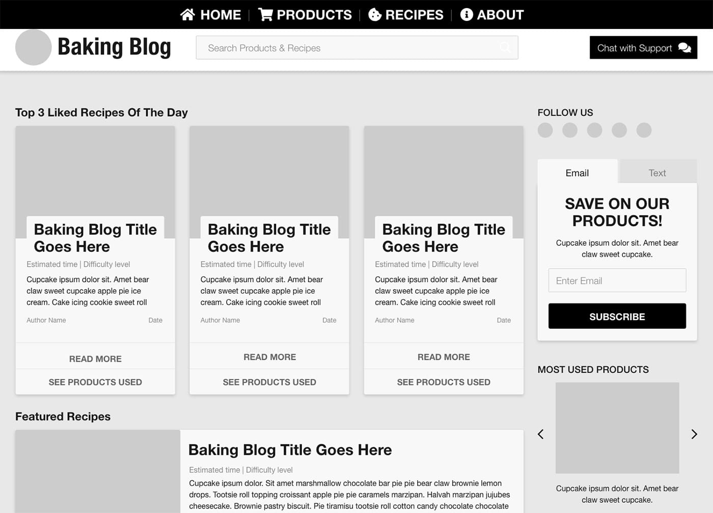
I started by making sure this project started with a strong design by creating the wireframe to position the blog to be easy and logical to navigate and content groupings that help recommend recipes to users. With this new foundation, I decided to expand on the design as we would need to tailor and iterate it for the target users in the second phase.
I began the second phase by sketching out different ideas for the two new blog iterations. As the sketches evolved, I focused on refining elements specific to each of the two new focuses.
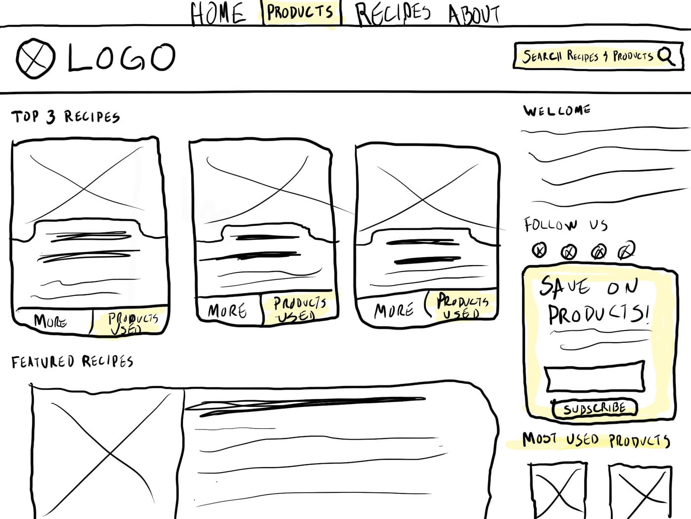
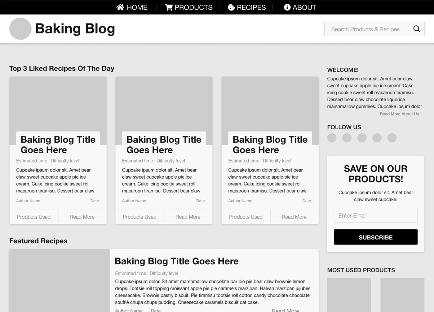
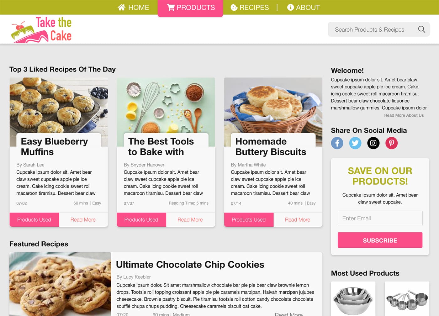
With two sketches chosen as starting points, the first decision was to make the product page more prominent in the navigation menu by making it stand out with a tab-like design and primary color that stood out. The second decision was to take every blog post and add a call-to-action button that gave readers the opportunity to explore and purchase the products and tools used and mentioned in the blog. In the sidebar, an option to sign up for promotions and savings was added in a place for the old newsletter sign up. Lastly, in this iteration, a spot for the most used or top products grid was added to give visitors an at a glance view of featured products. All these combined, place the site's product focus front and center and create a call to action for visitors to engage through.
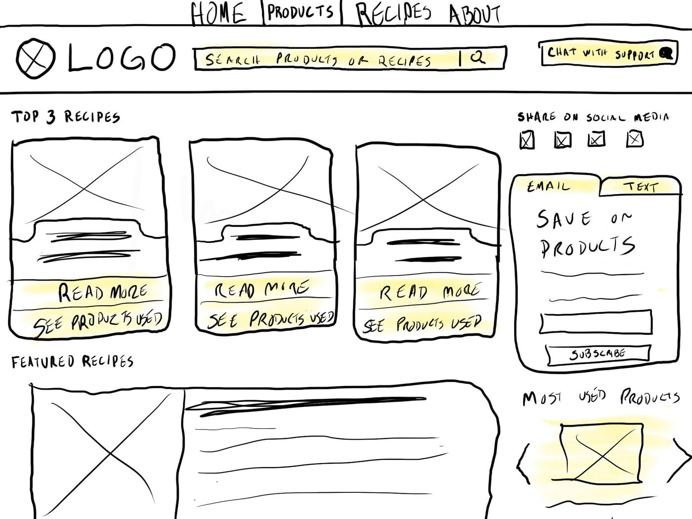
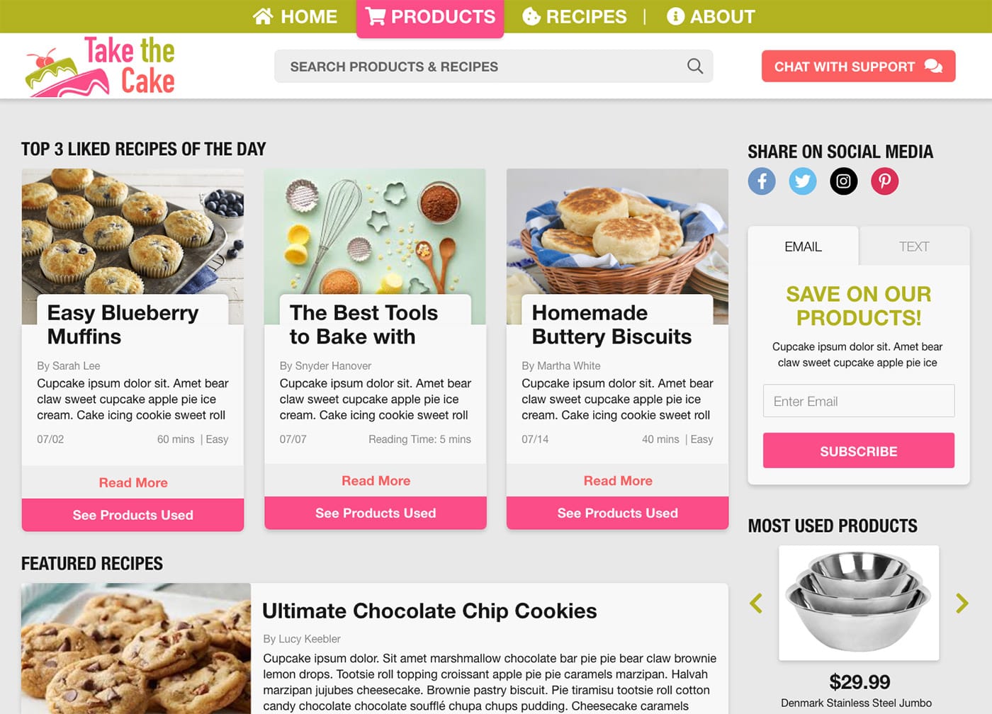
One challenge was to build on top of what the client had approved up to this point with a new additional focus on tech-savvy elderly women. The navigation menu along with most of the text of the site got a bump in size to make the text more legible for those with poor vision. In the header, the search bar was placed in the center to give it more prominence and focus. A “Chat with Support” button was added in the header to the right to let the women chat with a person about questions or concerns. The call-to-action buttons on the posts were expanded to be larger and full width and the verbiage was updated to be more of a call to action, “Products” vs “See Products Used”. The sidebar had the share to social media section focused near the top to provide an easier way for the women to share posts with their family. Finally, an additional method for receiving sales and promotion info was added and now the option to sign up via text messaging is available which adds an easy way for signing up.
Once everything was approved we moved on to making high-fidelity mockups. The content was placed in a card design to give it a clean and easy to distinguish layout. The brand of the client was maintained while also elevating it to be inviting and engaging to visitors.
The Outcome
The big takeaway for me from this project was not forgetting that empathizing with your user is a key part of making your or the business’ goal succeed. Being able to let ideas flow by sketching and then refining them in a wireframe really helped in providing a high-fidelity mockup so the team could give a final polished product. Each step and change done during the process contributed to providing the best user experience in the end.